We feel the importance of design in a tiny house should come first, right up there with considering your budget. Without a thorough design process in such a small space, what would be go unnoticed in a conventional sized house is amplified in such a compact space. Of course the details of what makes an attractive, functional design can mean different things to different people, but by applying some fundamental design principles in the Bisbee's plan, we knew it would result in a livable, beautiful, balanced space, whether for full-time living or for more occasional use. Here are those main 'rules' we chose to employ:
Using Common Architectural Features
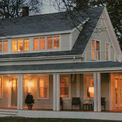
Common 'looks' include, for example, a mountain cabin, beach cottage, or farmhouse. Taking visual cues from traditional houses such as a covered porch (no matter how tiny!), dormers, a picture window, and quality materials like lap siding function to make a tiny house more appealing and recognizable to others. It may even be more welcome by neighbors and the general public in a wider variety of settings, as it will not to be confused with other small utilitarian structures such as sheds. In this way, it's more adaptive.
White Space
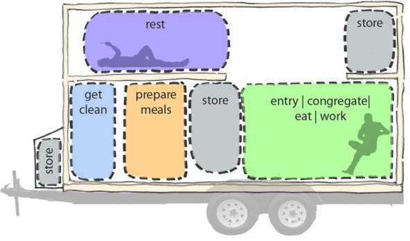
This principal in design says that some empty, uncluttered places to rest the eye should be present in every room, so storage areas and shelving (wardrobe, pantry, under counters, storage loft) are concentrated, rather than divided across all available wall and floor space.
Division and Placement of Use Zones
A half wall between the living room and kitchen denotes a transition to another room without blocking the any views between the rooms, and the wardrobe is deliberately made to look more like an independent piece of living room furniture (as opposed to a built in, part of the pantry) to further delineate the living 'zone' as separate from the kitchen 'zone' (see illustration of the Bisbee below).
Traffic Pattern and Flow
- The couch and table are placed out of the main traffic pattern that flows from the door to the kitchen--someone can sit and read/work/eat without others crossing directly in front of them (as would be the case without the window seat nook)
- The decision to locate the bathroom at the rear of the house rather than more central/paralleling the kitchen functions to widen the kitchen to accommodate two people, and is also considered important in the tradition of Feng Shui
- Light and cross ventilation are accounted for, as is privacy (utilize either frosting or other window coverings)
- Two people can fit comfortably in the kitchen together, which also has just under 6 feet of continuous counter/work space with standard depths and a standard sink
Other Elements
- Color choices inside and out: neutral, creamy, light tones reflect light and feel expansive
- For future adaptability: all built-in elements are attached to the walls rather than the floors (they can be removed)
- Designed to maximize heights and widths, within DOT standards
- Removable awnings: function to filter the elements (allow for open windows during rain and filter sunlight on hot days)
- Utility cubby outside maximizes the interior space that would otherwise be taken up with the utilities


